Module 4
WAVE Accessibility Check on Module 1 Post
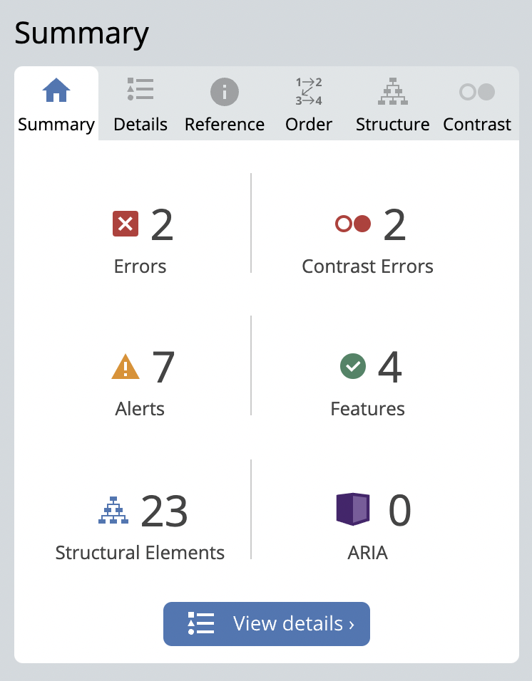
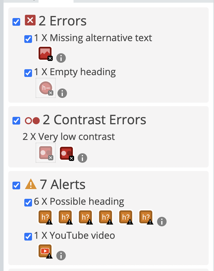
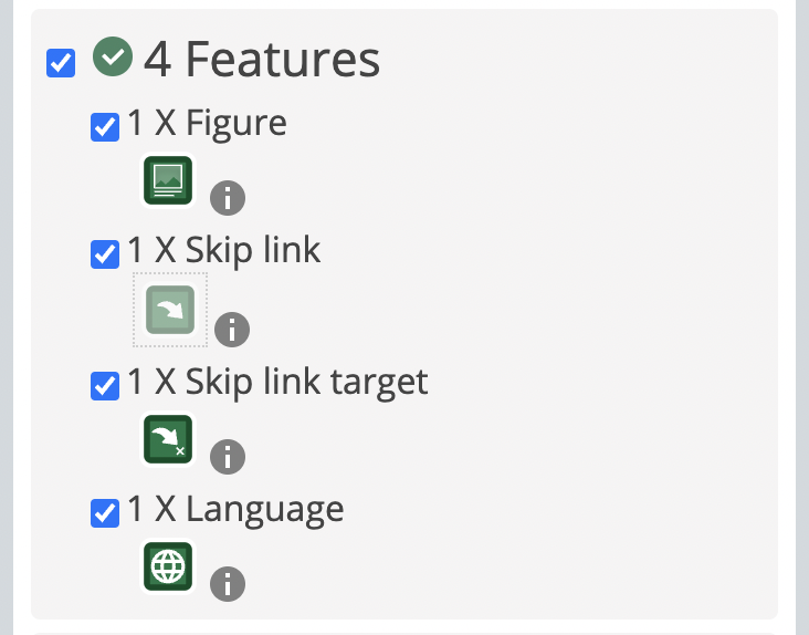
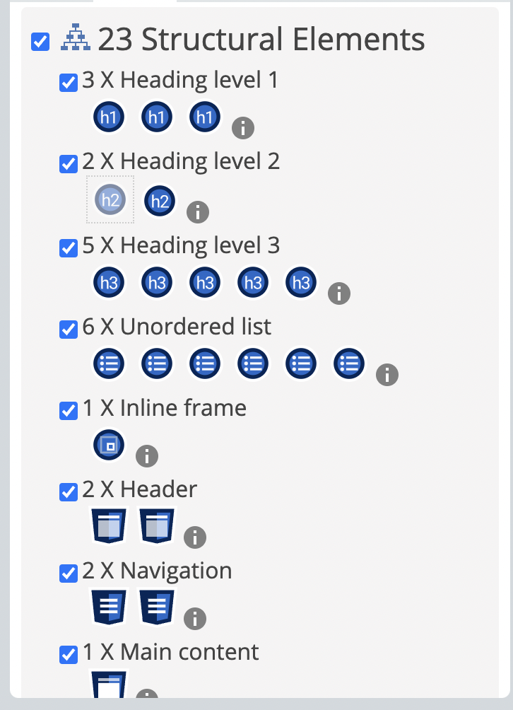
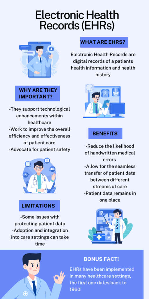
Canva Infographic: Electronic Health Records
Reflection
Working on the explore portion of this module allowed me to explore and integrate different principles and materials that were presented throughout the content. I enjoyed creating the infographic to demonstrate my knowledge of Electronic Health Records as well as conducting the Wave Assessment from my module 1 post. Additionally, using the text to speech tool to have it read aloud one of my blog posts was interesting to decipher and determine if I deemed the tool to be useful.
When conducting my Wave Assessment, there were not many aspects that were surprising to me. One aspect that stood out to me that is demonstrated in the screenshots above is that it gave me seven alerts that I had some problems with my headings, or having space for a heading but no text. Many of my headings included were not properly formatted as headings, which I can see now and will work to ensure that my headings are correct for my future blog posts. I also noticed that one of the errors it gave me was that I was missing alternative text for the AI generated image that I created, which was untrue as I included text associated with the image below. The assessment may have not picked up on that as it was not directly attached to the image. The Wave Assessment was a great tool to see how my blog posts are formatted in terms of structural elements as well as errors that may be present so that I can work to mitigate those errors for upcoming work.
Before this module, I had yet to use a text to speech tool. For the text to speech portion of this module I used the Read Aloud Chrome Extension. I had it read aloud my Module 2 blog post. Immediately upon listening it was very difficult to understand. The voice was automated and sounded very robotic. The words were said with either pauses in between, or all jumbled together. I was able to make out what the automated voice was saying but only by concentrating intensely on what was actually being said. I closed my eyes and gave it a listen, and was unable to piece together the content that was actually being presented as I was too focused on ensuring that I actually understood the words it was saying. The idea of this tool is to promote accessibility and equity for those with disabilities, specifically for the visually impaired. This tool however, did not prove to be effective for having content read aloud and I did not find it inherently useful. However, I do not have a lot to base the effectiveness of all text to speech tools as I do not use them regularly and have not explored their capabilities as well as other tools that perform similar tasks. I can only imagine that a visually impaired individual may also see this tool as a challenge to use when trying to learn content.
Another piece of the explore module was to create an infographic on either content that we have touched on in this course or something that we are interested in. I chose to create an infographic about Electronic Health Records (EHRs). I chose this topic as it resonates with my degree in Health Information Science and I am very passionate about the topic, and am pursuing a career surrounding the adoption of EHRs in Healthcare. When creating this infographic, I ensured that I was following the design principles that were outlined in this module, as well as making it coherent, well designed, and easy to read. I also ensured to use a basic font and tried to keep the language as simple as possible for ease of access. All the elements that I included whether that be text or images I made sure they were in alignment with each other and that they were cohesive. As well as alignment, I utilized proximity when aligning the text and images, ensuring not to leave awkward gaps or spacing between the elements, all while leaving a fair amount of negative space. Additionally, I organized the information on a hierarchical level so that it flows and the intended reader can read the information in a way that makes the most sense. Finally, I chose a colour theme and graphics that compliment each other support the design choices I made with the design.
I think that when creating and designing content, it is important to be aware of who your audience may be and what sort of modifications should be made for the content to be accessible for those with disabilities. Svetlana Kouznetsova explains the importance of captions in the Ted Talk “How captions increase ROI and audience for media creators,” as not only makes content more accessible, but it also allows for the content to reach a much larger audience, therefore benefiting the content creator in return. One may think that captions only help those who are audibly impaired, however, captions also allow for those who do not speak the language to understand and interpret the content that is being presented. I believe that inclusive design means being aware of the accessibility of the content presented and those that may want to utilize your content. As well, created content that is accustomed and tailored for a wide array of people it so that it mutually benefits both the individual who accesses the content and the one creating the content to expand their audience. Overall, there were many concepts that I will take from this module to apply to future work in this course along with other courses and work in general.
References
Module 5
Storytelling using Twinery


Video for a Learning Purpose
Rough Draft Script
Hi everyone, today I will be demonstrating how to do a very simple hairstyle, two braids.
This hairstyle is perfect for those who want to learn more about doing hair and offers a simplistic yet cute hairstyle that takes little time to master.
First you begin sectioning the hair into two parts, right down the middle.
Once the hair is parted start by taking one half and dividing it into 3 pieces
Start by taking one of the pieces furthest back and cross that over the center piece
Then, take the front piece and cross it over that piece, which is now the new center
Repeat this process, crossing each outer piece over the center
Once you reach the bottom, take any form of hair tie and secure the ends tightly
Repeat the process with the other half of the hair
And you’re done!
Reflection
This module allowed me to explore different aspects of storytelling, creating digital pieces of media for learning purposes, and integrating storyboard writing and scripting. It also provided me insight as to how effective storytelling can be through passing on knowledge and information through generations of human beings.
Twinery was an interesting tool to use unlike online software I have used before. I created a very simple story to demonstrate a girl in university going through a day in her life. The story took the user through her day and in each passage allowed for a decision about how her day was going to go. This interactive piece allows the user to partake in a story but also allows them to have some automony as to how the story will play out, which I thought was very unique and intriguing. It overall offers a different approach to storytelling that actively engages users. Upon reflection, I think that for next time if I were to use Twinery again I would play around and familiarize myself with the software more so that I have the ability to add images to make the story more engaging and give it more depth and personality. When creating my story using Twinery, it reminded me a lot of Black Mirrors Bandersnatch, where the viewers are actively engaged in the movie and making decisions for the characters. It had different outcomes for the array of decisions that were presented throughout the film. I remember partaking in watching this film and found it pulled me in and left me very intrigued about where my decisions were going to take me, and thought it was a very neat concept.
For my video for a learning purpose, I decided to keep it simple and use my iPhone to create a short tutorial on how to do two simple braids. When creating this piece of media, I ensured that I met and followed some guidelines for creating educational videos that were outlined in this module. First off, keeping my video as short as possible, and choosing to speed up repetitive clips. This ensures that the viewer does not get lost or bored watching my video. This is reflected as Mayer’s Coherence Principle. Additionally, I chose to keep my narration simple and using a conversational tone according to the guidelines, which demonstrates Mayer’s Personalization Principle. The tutorial I chose to create was very simple, so I think it did not require all the guidelines for an educational video, as additional pieces such as text, visual elements, and active elements were not needed to make the video better. I do think that in many scenarios, including these principles in educational videos can be beneficial to both the viewer and the content creator. I think for next time I would maybe choose a more in depth topic to explore and teach, allowing me to create a more impactful piece of media for my audience.
The explore portion of this module allowed me to create interactive and educational pieces of media to reflect the different topics that were discussed. I think it is important to recognize the importance different media has on learning and human development. In the video “The Power of Storytellling in Teaching” by Andrea Turner, she speaks about how our favourite pieces of media stick with us, and we connect to them on a personal level. Oftentimes we become so immersed in the media that we forget that we are learning immensely from the content that we are consuming. For me personally, a storytelling technique I often struggle with is the personalization side. I find it hard to open up and share stories about myself personally, so I often avoid doing so. I feel that this carries on into sharing a story that will not only immerse my audience, but also move them. The lack of my personalization makes it more difficult for storytelling to really connect with the audience. Something I enjoy when creating and telling stories is creating different characters and placing an emphasis on bringing them to life. This module gave me the chance to create storytelling media as well content for a learning purpose which allowed me to reflect on their importance and that in some ways they work hand in hand together.